Projects
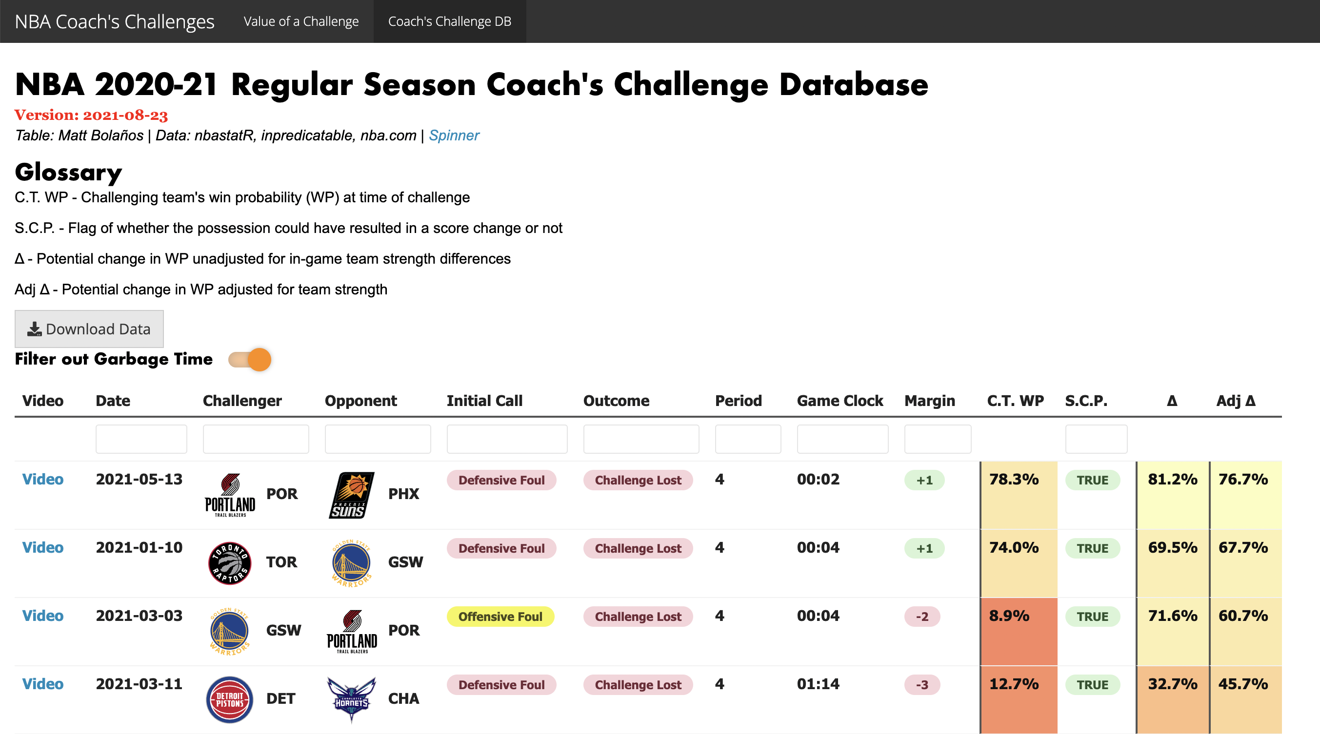
I investigated the quantitative side of NBA coach's challenges by calculating the win probability differences between the true outcome and the "counterfactual" outcome. I summarized my findings in an R Shiny app, along with an interactive table to allow the user to explore my database of NBA 2020-21 regular season coaching challenges.
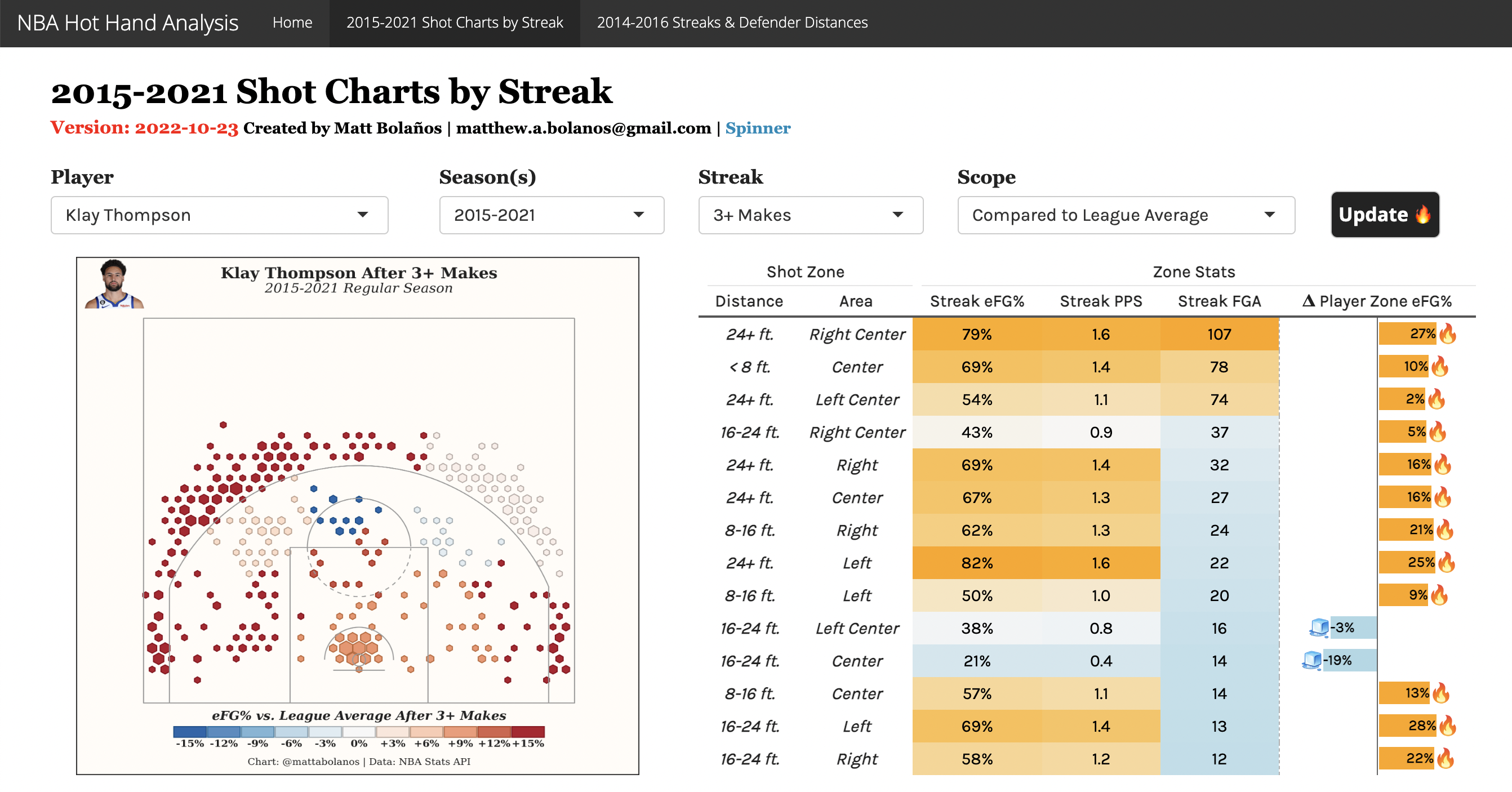
I created two different tools to visualize the potential effects of the Hot Hand in an R Shiny app. The first allows the user to create shot charts of NBA player efficiency changes during hot or cold streaks on 1.2 million shots from the 2015-21 seasons. The second is an interactive table that incoporates raw x-y tracking data on the 2014-16 seasons from SportVU, to divide streaks by closest defender distances.
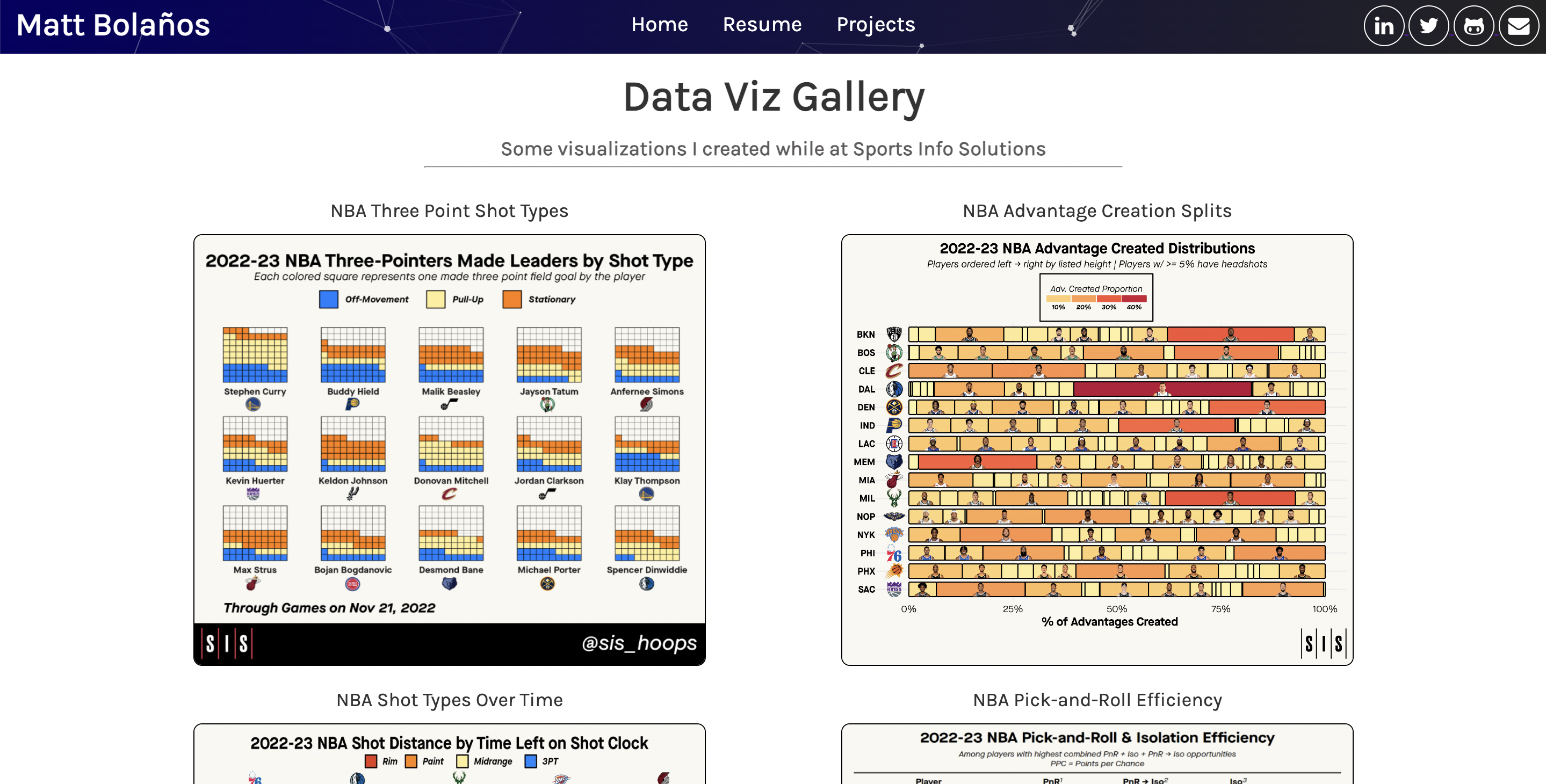
A composition of some of the external-facing NBA data visualizations that I made at Sports Info Solutions. The vast majority of the visualizations were developed in ggplot, and all of the featured visualizations are linked to the corresponding tweet on the company Twitter account.
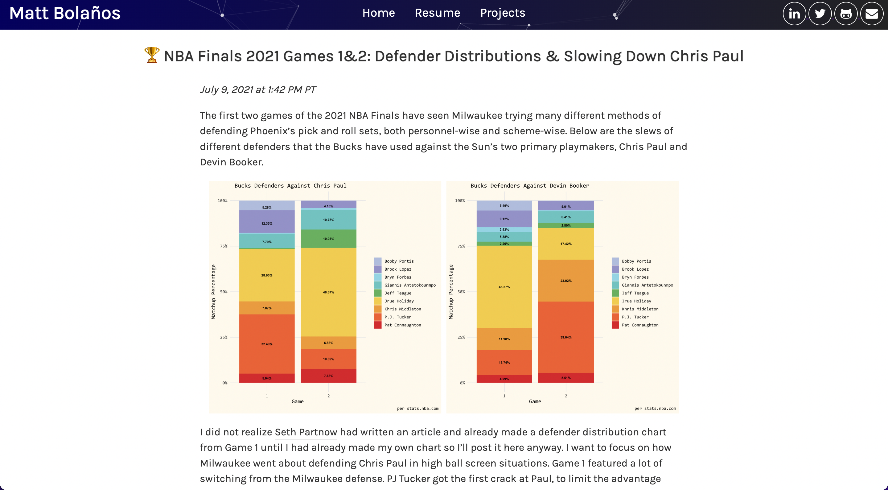
I analyzed the changes in the Milwaukee Bucks' defensive scheme against Chris Paul and Devin Booker in Games 1 & 2 of the 2021 NBA Finals using data from the detailed box score endpoint in the NBA API. I created visualizations of the primary defender splits that Paul and Booker faced, and then brought in clips from those two games to take a deeper look at how Paul was able to take advantage of the defensive coverages thrown his way in ball screens.
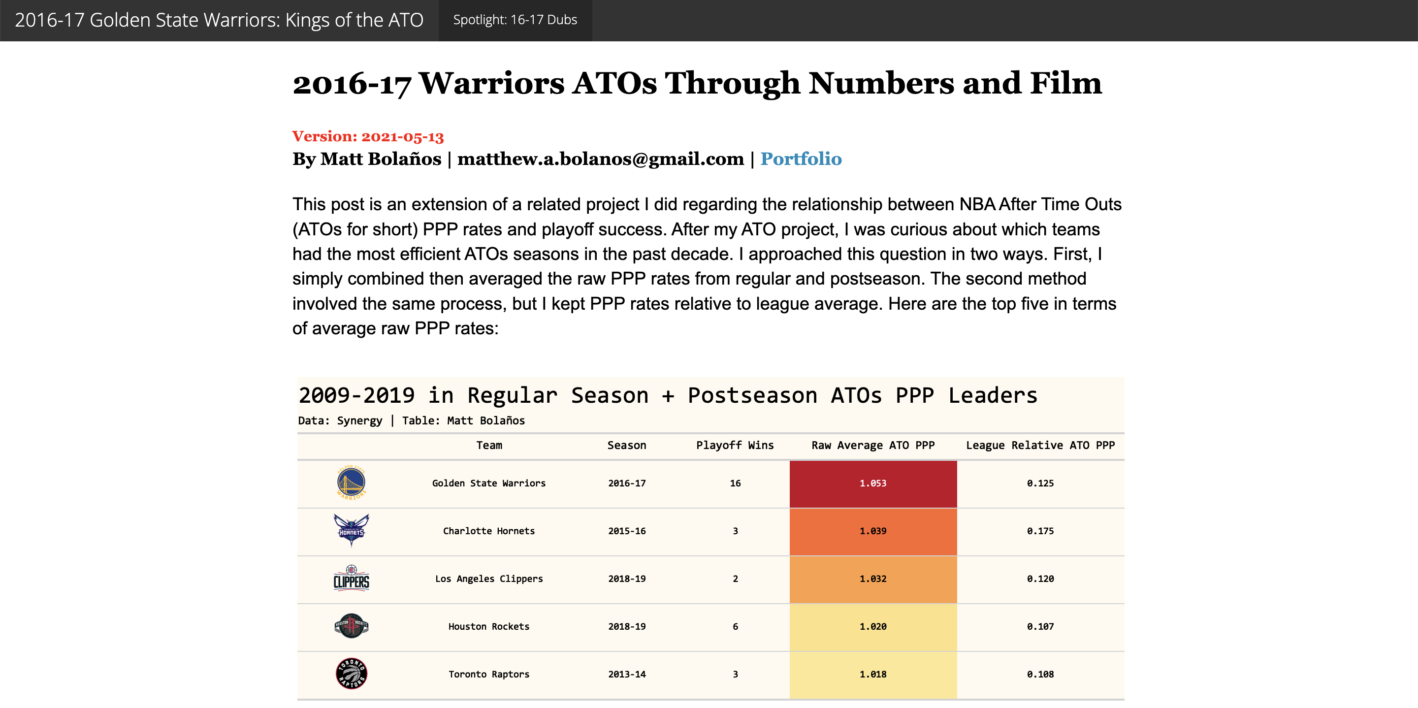
Following an investigation on relationships between efficiency on after time out plays (ATOs) and NBA Playoffs success, I conducted a brief analysis on one of the most efficient ATO teams (in terms of Points per Possession) from the past decade or so: the 2016-17 Golden State Warriors. This app showcases and dissects the offensive play designs that created many high quality Warriors shots.
